
- 011. Add Padding So It Can Breathe
- 022. Put It on a Background
- 033. Round the Corners and Add a Shadow
- 044. Wrap It in a Device or Browser Frame
- 05The Fast Way: Beautify Screenshots With Mocksy
- 06Keep Your Style Consistent
- 07Where Professional Screenshots Matter Most
- 08Common Screenshot Mistakes to Avoid
- 09How to Take a Screenshot on Mac First
- 10Beautifying Screenshots for Social Media
- 11Speeding Up With a Repeatable Workflow
- 12Frequently Asked Questions
- 13Free vs Paid Ways to Beautify Screenshots
- 14The Bottom Line
A raw screenshot looks flat, cramped and a little unfinished, no matter how good the content inside it is — fine for a quick share, but not for a blog post, a product page, a pitch deck or social media. The good news is that making screenshots look professional takes seconds once you know the few things that separate an amateur grab from a polished graphic. Here is how to make your screenshots look professional, on Mac especially, with the fastest, no-design-skills way to do it on any Mac.
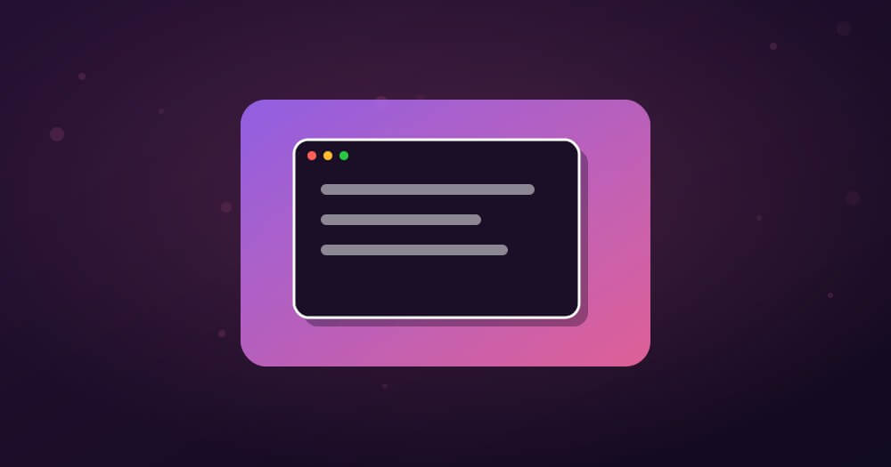
Short Answer: To make a screenshot look professional, add padding around it, place it on a nice background (a gradient or solid colour), give it rounded corners and a soft shadow, and optionally wrap it in a device frame. These few touches turn a flat screen grab into a polished graphic. On a Mac, a tool like Mocksy does all of this in one click, so you get a gradient-wrapped, share-ready image in seconds instead of fiddling in an editor.
You have seen these polished screenshots everywhere — in app marketing, on landing pages, in tech articles. They are not hard to make; they just follow a handful of visual rules. Let us break them down.
What makes a screenshot look professional:
- Padding around the image so it can breathe
- A background – gradient or solid colour
- Rounded corners and a soft shadow
- An optional device or browser frame
- Consistent style across your images
1. Add Padding So It Can Breathe
The single biggest giveaway of a raw screenshot is that the content runs edge to edge with no space around it. Adding padding — empty space around the screenshot — instantly makes it feel intentional and designed. It gives the eye room and separates your image from the surrounding text. Almost every professional-looking screenshot sits inside generous padding, and adding it is the quickest upgrade you can make.
2. Put It on a Background
That padding looks best filled with a background rather than left white. A subtle gradient is the modern favourite — it adds depth and colour without distracting from the content — but a clean solid colour works too. The background is what gives those polished marketing screenshots their premium feel. Matching the background colour to your brand makes a set of images feel cohesive and deliberate.
3. Round the Corners and Add a Shadow
Sharp rectangular corners look raw; softly rounded corners look designed. Pair that with a gentle drop shadow, and the screenshot appears to float above the background with a sense of depth. These two small touches — rounded corners and a soft shadow — do a huge amount of the work in making an image feel professional rather than pasted in.
4. Wrap It in a Device or Browser Frame
For extra polish, place the screenshot inside a device frame — a Mac window, a browser bar, or a phone body. A frame gives context (this is an app, this is a website) and looks instantly more professional, which is why app stores and product pages use them constantly. A simple browser or window frame around a web screenshot is often all it takes to elevate it.
The Fast Way: Beautify Screenshots With Mocksy
Doing all of this by hand in an image editor works, but it is slow and fiddly for every single screenshot. Mocksy is a lightweight Mac app that does it in one step: it turns boring, flat screenshots into stunning gradient-wrapped graphics in under 30 seconds, right on your Mac. Padding, a beautiful gradient background, rounded corners and shadow — applied instantly, so you get a share-ready, professional image without opening Photoshop. For anyone who shares screenshots regularly — in posts, decks, docs or social — it removes the tedious part and just gives you a polished result.
Get Mocksy for Mac ↗
See Mocksy in action →
Keep Your Style Consistent
If you make more than one screenshot for the same post, deck or product, consistency ties them together. Use the same background, the same padding and the same corner and shadow style across all of them, and the set looks like a designed system rather than a pile of random grabs. Consistency is a big part of what makes brands’ screenshots look professional — and it is far easier when a tool applies the same style automatically each time.
Where Professional Screenshots Matter Most
Polished screenshots pay off anywhere images represent your work. In blog posts and tutorials, they make your content look credible and easier to follow. On product pages and app stores, they directly influence whether people sign up or download. In pitch decks and proposals, they signal attention to detail. And on social media, a nicely framed screenshot stops the scroll where a raw one gets ignored. In every case, the small effort to beautify a screenshot returns outsized results. If you also record your screen, our guide to the best screen recorders for Mac pairs well for creating polished visual content.
Warning: Before sharing a screenshot publicly, check it for sensitive information — names, email addresses, account numbers, private messages, tokens. It is easy to capture something in the background you did not intend to share. Crop or blur anything private before you post, no matter how polished the image looks.
Common Screenshot Mistakes to Avoid
A few habits keep screenshots looking amateur. Capturing too much — the whole screen when you only need one window — buries your point; crop tight to what matters. Leaving cluttered backgrounds, notifications or unrelated tabs in the shot distracts from the content. Over-editing with heavy filters or busy backgrounds fights the screenshot rather than framing it. And inconsistent styles across a set make everything feel thrown together. Keep it clean, cropped and consistent, add the polish touches above, and your screenshots will look professional every time.
Checklist: make a screenshot look professional
- ✅ Crop tight to what matters
- ✅ Add padding around the image
- ✅ Place it on a gradient or solid background
- ✅ Round the corners and add a soft shadow
- ✅ Add a device or browser frame if it helps
- ✅ Keep the style consistent across a set
- ✅ Remove any sensitive information before sharing
How to Take a Screenshot on Mac First
Before you beautify a screenshot, you need to capture it cleanly. On a Mac, press Command-Shift-4 to select an area, Command-Shift-4 then Space to capture a single window (which adds a nice shadow automatically), or Command-Shift-5 for the full capture toolbar with more options. Capturing just the window or the specific region you need — rather than the whole cluttered screen — is the first step to a professional result, because a tight, relevant capture is far easier to make look good than a busy full-screen grab. Once you have a clean capture, the beautifying steps do the rest. Getting into the habit of capturing the right area precisely saves cropping later and keeps your screenshots focused on exactly what you want to show.
Beautifying Screenshots for Social Media
Social platforms are where polished screenshots pay off most, because a nicely framed image stops the scroll while a raw grab gets ignored. For social, lean into a bold gradient background and generous padding so the image reads clearly even at small sizes, and keep any text in the screenshot large enough to be legible on a phone. Square or portrait formats often perform better in feeds, so consider the aspect ratio when you add your background. Because you are usually posting several images over time, a consistent background style becomes part of your visual brand, making your posts instantly recognisable. A tool that applies the same look each time makes maintaining that consistency effortless, which matters more on social than almost anywhere else.
Speeding Up With a Repeatable Workflow
If you make screenshots regularly, the real win is a repeatable workflow rather than one-off editing. Settle on a background, padding and shadow style you like, and apply it the same way every time so you are not making design decisions on each image. This is where a dedicated tool earns its place: instead of rebuilding the look in an editor, you drop in the screenshot and get your established style applied instantly. Over a week of posts, docs and decks, that consistency saves real time and makes everything you produce look like it came from the same designed system. The goal is to make “professional” the default output of your process, not an extra step you have to remember.
Frequently Asked Questions
How do I make my screenshots look professional?
Add padding, place the screenshot on a gradient or solid background, round the corners, add a soft shadow, and optionally wrap it in a device frame. These touches turn a flat grab into a polished graphic. On a Mac, a tool like Mocksy applies all of this in one click.
What is the easiest way to beautify a screenshot on Mac?
Use a dedicated tool. Mocksy turns flat screenshots into gradient-wrapped, professional graphics in under 30 seconds on your Mac, handling padding, background, corners and shadow automatically, so you do not have to build the look manually in an editor.
Why do my screenshots look flat and amateur?
Usually because they run edge to edge with no padding, background or shadow. Raw screen grabs lack the space and depth that make marketing screenshots look designed. Adding padding, a background and a soft shadow fixes it immediately.
Should I add a device frame to my screenshots?
Often, yes. A device or browser frame gives context and looks more professional, which is why app stores and product pages use them. It is not always necessary, but for app and website screenshots a frame usually improves the result.
What background is best for screenshots?
A subtle gradient is the modern, premium-looking choice, though a clean solid colour works well too. Matching the background to your brand colours keeps a set of screenshots cohesive. Avoid busy or distracting backgrounds that compete with the screenshot content.
Do I need design skills to make professional screenshots?
No. The look comes from a few simple, repeatable touches — padding, a background, rounded corners and a shadow — not from design talent. A tool like Mocksy applies all of them automatically, so anyone can produce professional-looking screenshots without knowing any design software.
Free vs Paid Ways to Beautify Screenshots
You can beautify screenshots for free in editors like GIMP, Photopea or even Preview, and free web tools exist too, but they trade your time for the saving. Building padding, a gradient, rounded corners and a shadow by hand takes minutes per image and some skill, and web tools mean uploading your screenshots and switching contexts. A paid native tool like Mocksy costs a small one-time fee and, in return, collapses that whole process into one click that runs locally on your Mac. If you only beautify a screenshot once in a blue moon, free is fine. If you do it weekly for posts, docs, decks or a product, the time a dedicated tool saves — and the consistency it gives your images — pays for itself very quickly. As with most tools, the right choice comes down to how often you do the task.
The Bottom Line
Professional-looking screenshots come down to a few simple touches: padding, a nice background, rounded corners, a soft shadow, and sometimes a device frame. You can do these by hand, but for everyday use a Mac tool like Mocksy applies the whole polished look in one click, turning flat grabs into gradient-wrapped graphics in seconds. Crop tight, keep your style consistent, remove anything private, and your screenshots will elevate every post, deck, tutorial and product page you put them in — with almost no time spent.
Beautify screenshots — Get Mocksy ↗
Related: turn ugly screenshots into gradient-wrapped graphics, and the best Mac apps for power users.